
graphic design
⋆˚꩜。ּ
digital marketing
.✦ ݁˖
graphic design ⋆˚꩜。ּ digital marketing .✦ ݁˖
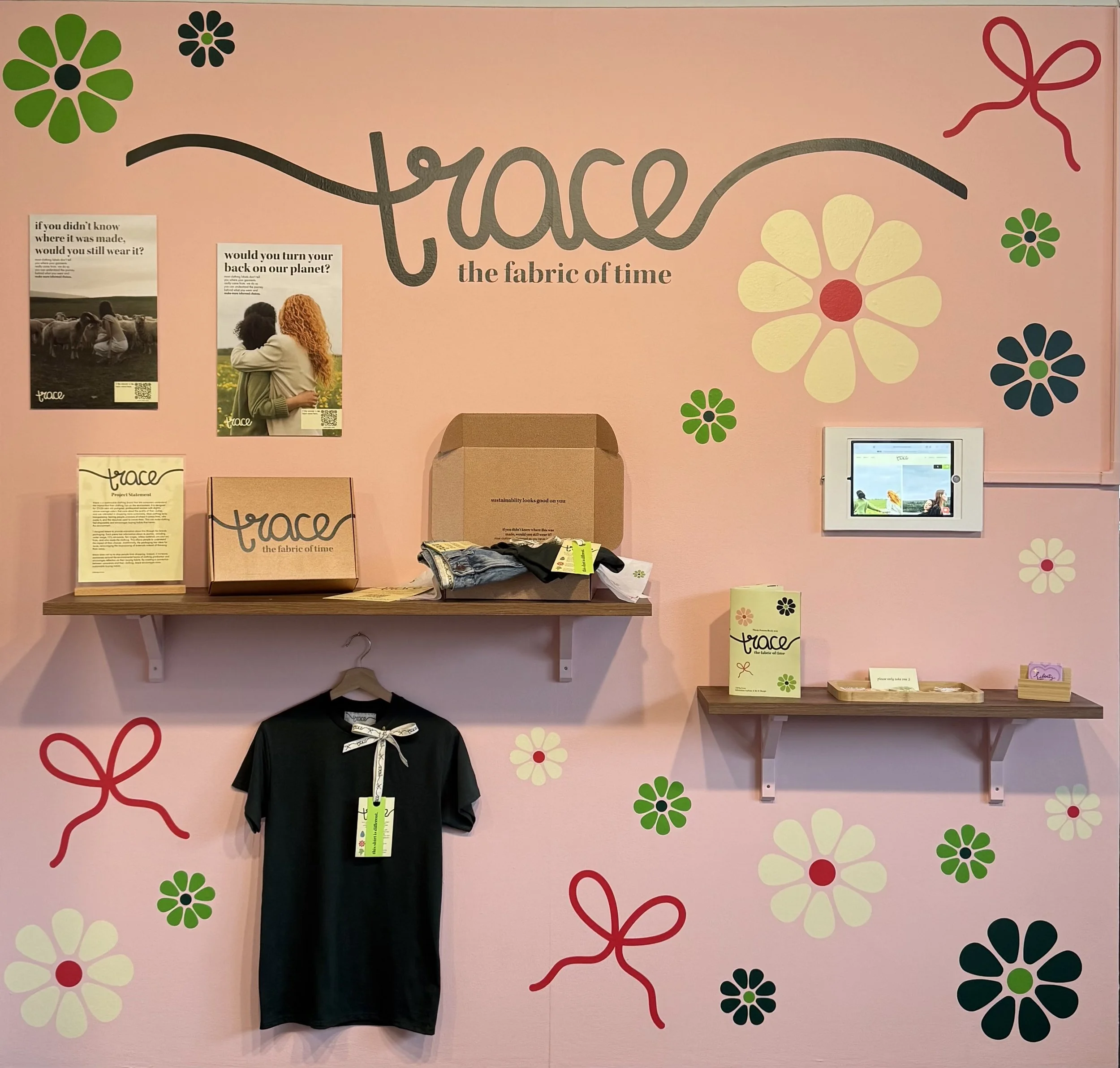
trace
Branding + Packaging + Website + Advertising Design
2026 MIAD Alumni Senior Thesis Grant Award (Communication Design)
trace is a sustainable clothing brand that lets consumers understand the impact that their clothing has on the environment. Most clothing lacks transparency, leaving people unaware of where it comes from, who made it, and the resources used to create them. This can make clothing feel disposable and encourages buying habits that harms the environment.
I designed trace to provide education about this through the brand’s packaging. Each piece has information about its journey, including water usage, CO₂ emissions, fair wages, where materials are sourced from, and who made the clothing. This allows people to understand the impact of their choices. Additionally, the packaging has ideas for reuse, encouraging the re-purposing of materials instead of throwing them away.
trace does not try to stop people from shopping. Instead, it increases awareness around the environmental harms of clothing production and encourages reflection on their buying habits. By creating a connection between consumers and their clothing, trace encourages more sustainable buying habits.
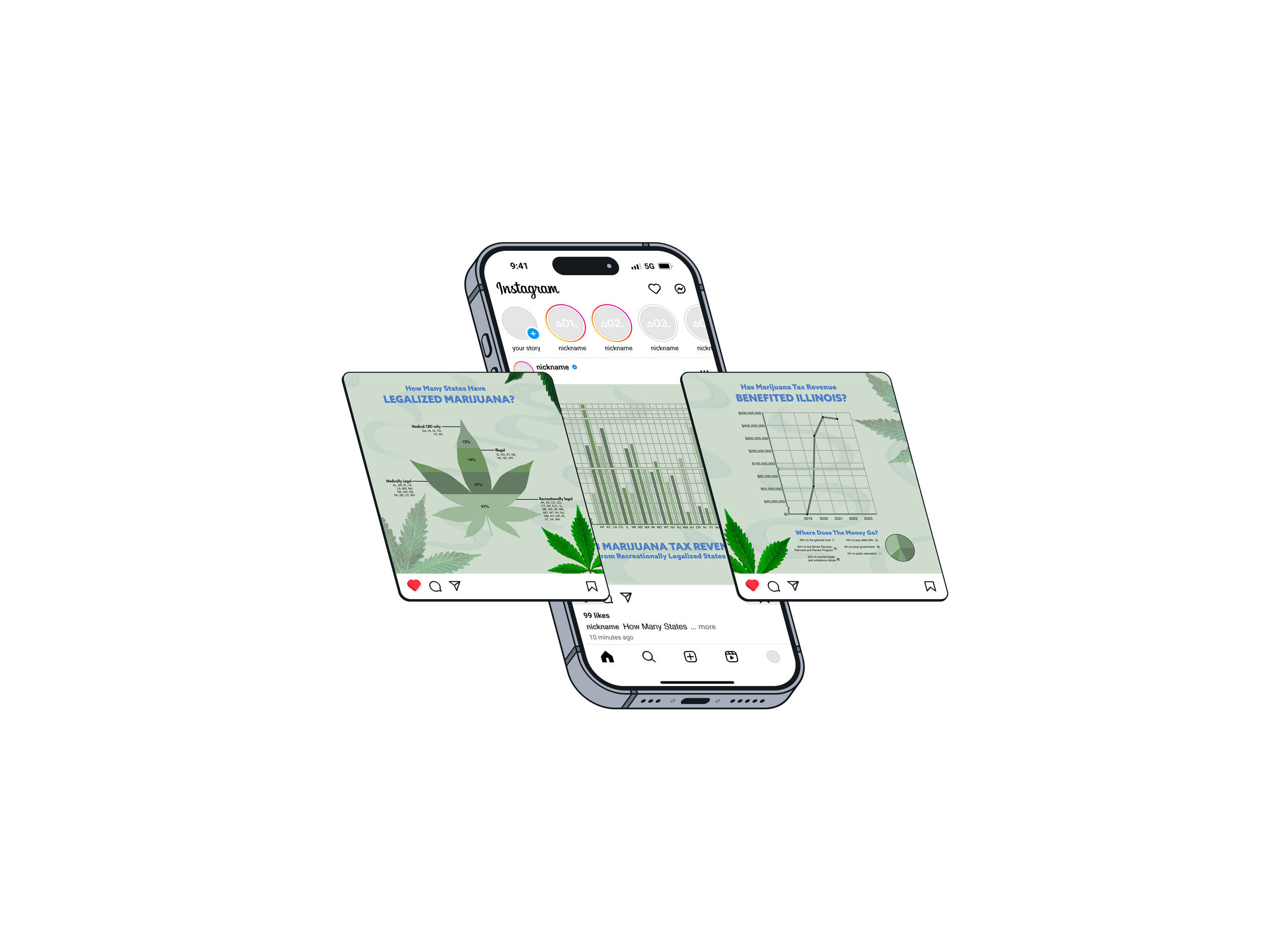
Cannabis Tax Info Campaign
Social Media Campaign + Website Design
This project started as an Instagram carousel and grew into a bigger question: if cannabis legalization is framed as a public health and justice, where's the proof? Tax revenue gets mentioned in legalization conversations, but it rarely gets broken down, then made visual and legible to someone scrolling on their phone for ten seconds.
I built this as a campaign because the story doesn’t fit in one post. Illinois is the focus because their approach is different. The R3 program is funded through 25% of tax dollars made from cannabis, and given to communities the War on Drugs, poverty, incarceration, and violence damage the most.
Stylistically, I wanted this to read as editorial rather than technical and explanatory. Retro typography and a bold color palette grabs attention while the numbers tell the story. The goal was a piece that works whether someone reads all eight slides or just shares one stat graphic and moves on. Both share the same point, legalization is an ongoing redistribution of money, and where that money goes is important.
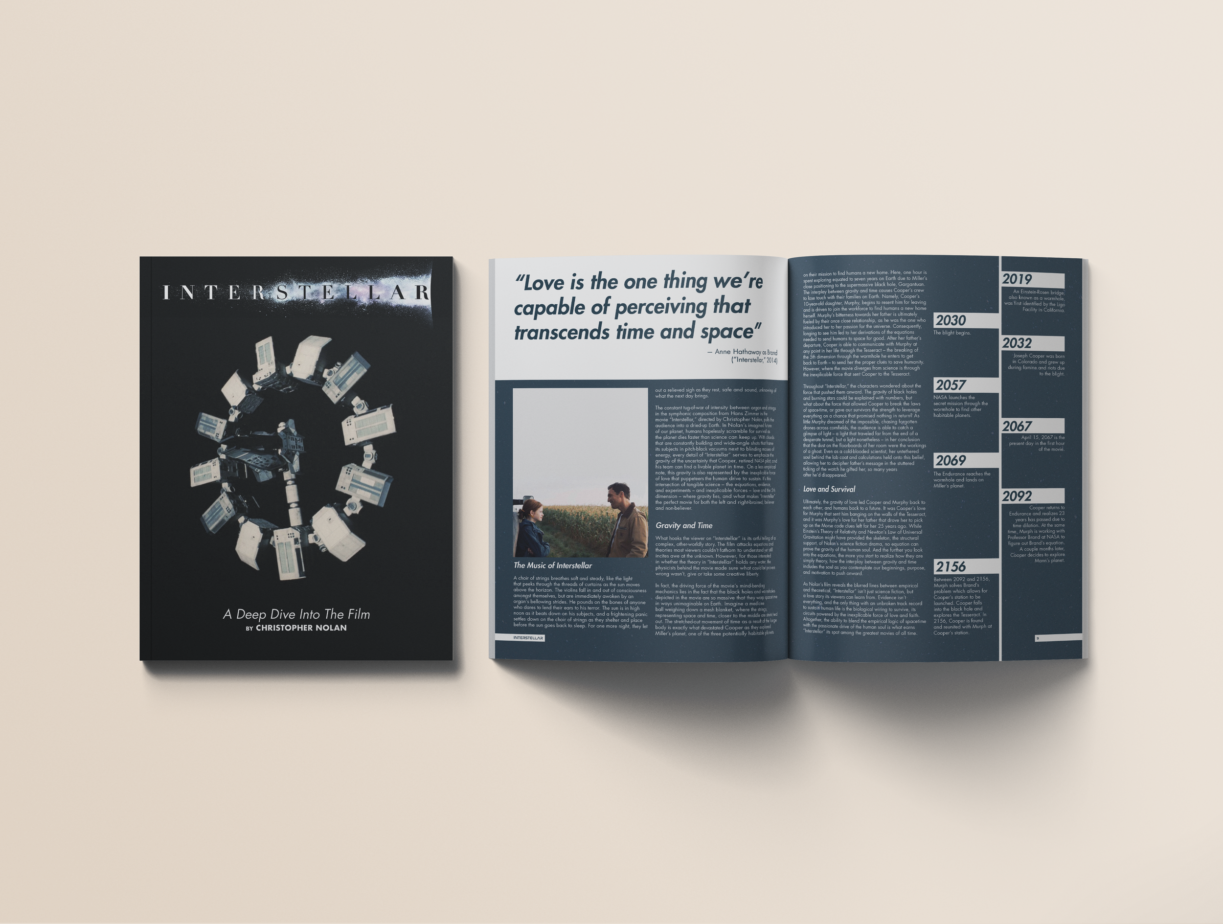
Interstellar Magazine
Publication Design
The design of this magazine follows the same push and pull of science and humanity that Interstellar shows. A two-column grid stays rigid, replicating the certainty of science. The only thing allowed to break it is the photography and humanity, the same way love and connection break through the plot.
My choices of color and typography reflect this. Blue is the cold, technical side, orange is the human side, and purple sits in between since so much of the film happens in the middle. The blocky, space-inspired typography is inspired by NASA, but stays simple enough that it doesn't feel overly technical. This makes it feel approachable and digestiable.
The purpose of this magazine is to make the viewers think more critically about the art and science behind the film. Whether that be reflection on the film, rewatching it, or searching for more information about topics mentioned in this edition.
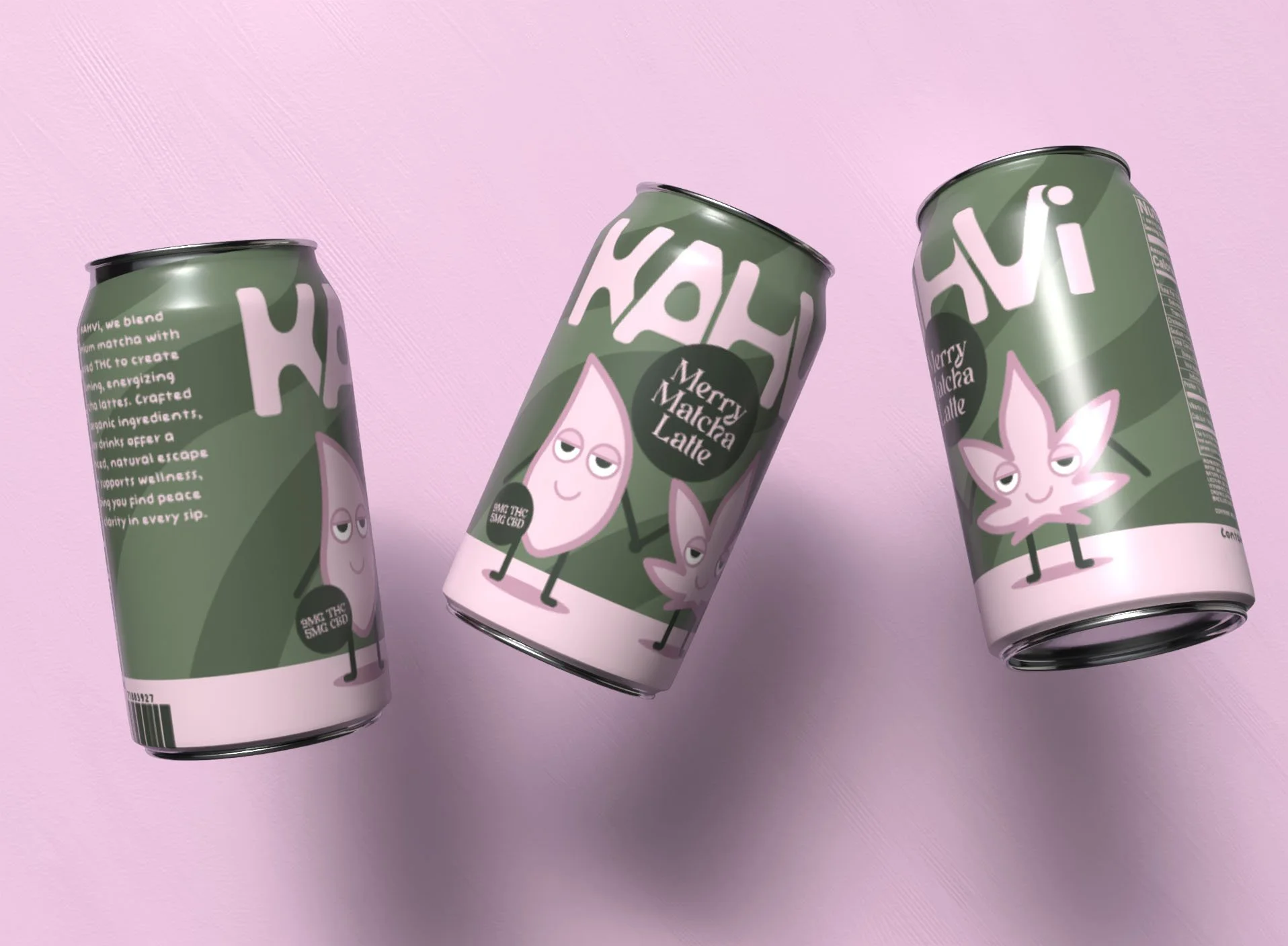
KAHVI
Packaging Design + Social Media Campaign
Kahvi is an infused beverage company named after the Finnish word for coffee. Instead of selling you coffee, it’s selling the calm, peaceful moments that come with your coffee break but with different ingredients.
The palette is muted pink and green on purpose. Every other infused drink on the shelf is neon and trippy, it advertises the high before you even drink it. Kahvi doesn't do that. The design portrays the calming and energizing matcha latte that’s on the inside and stands out on the shelves.
The campaign is built around the same idea. Most infused drinks try to sell the high itself with loud captions and neon visuals. Kahvi doesn't do that either. The content follows Cha and Bud, the matcha and cannabis leaf characters from the can, carrying the same calm, easygoing energy that's already on the package.
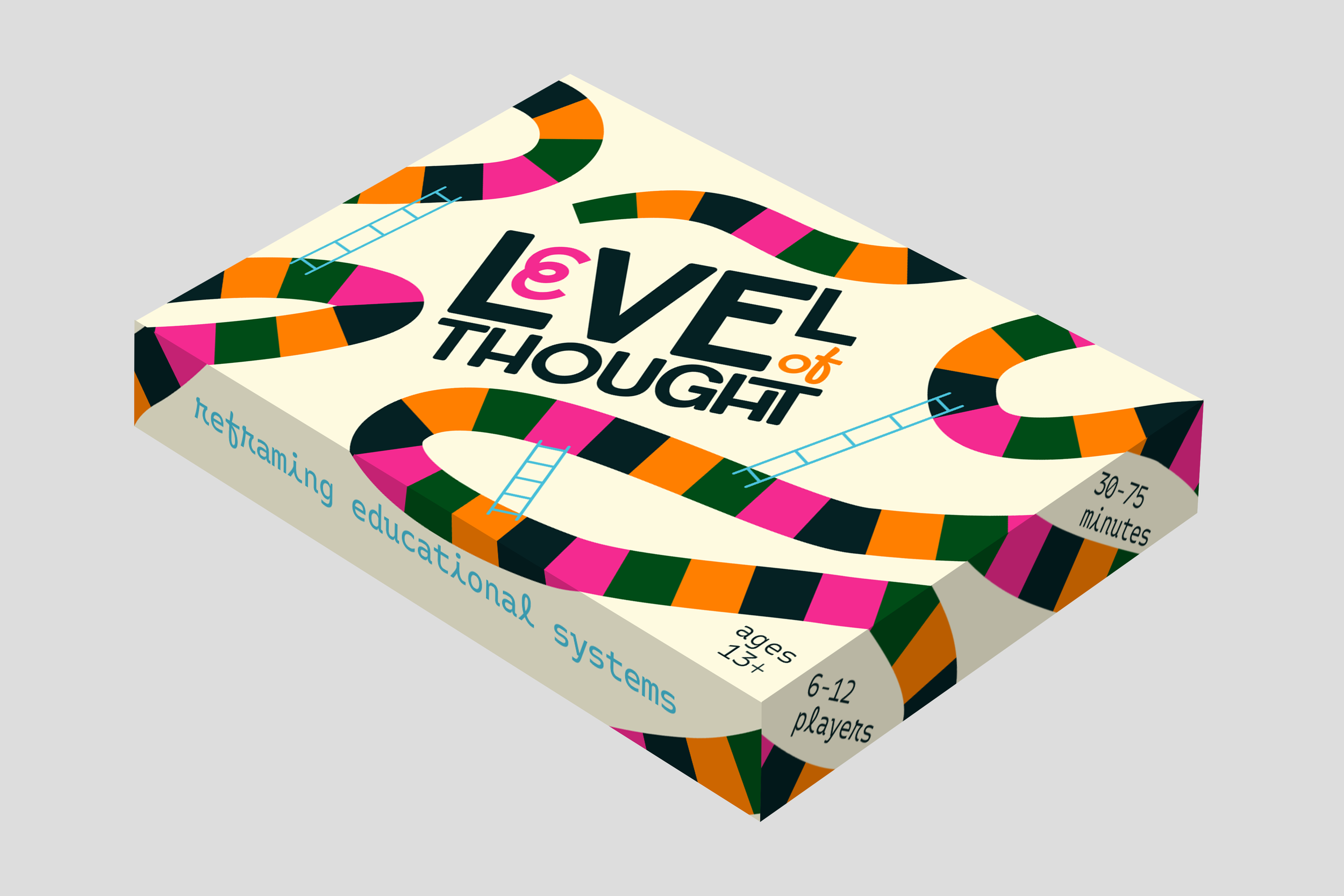
Level of Thought
Packaging + Game Design
High school aged kids are often taught in a way that rewards black and white answers and favors speed. Unfortunately, the world isn’t build like that. Learning is often reduced to just performance, when an integral part is being able to fully understand concepts.
Level of Thought is a board game designed to teach kids that learning is about a process of decisions and experiences, not just having the right answer. This game reframes learning to help students develop critical thinking skills and reflection while also teaching that there are trade offs and consequences to every decision they make. Educational systems shape how we learn, and Level of Thought challenges those ideas. Students learn that progress doesn’t always have to be forward and that wrong answers still have value. What matters is that you understand how you were wrong and do better the next time.
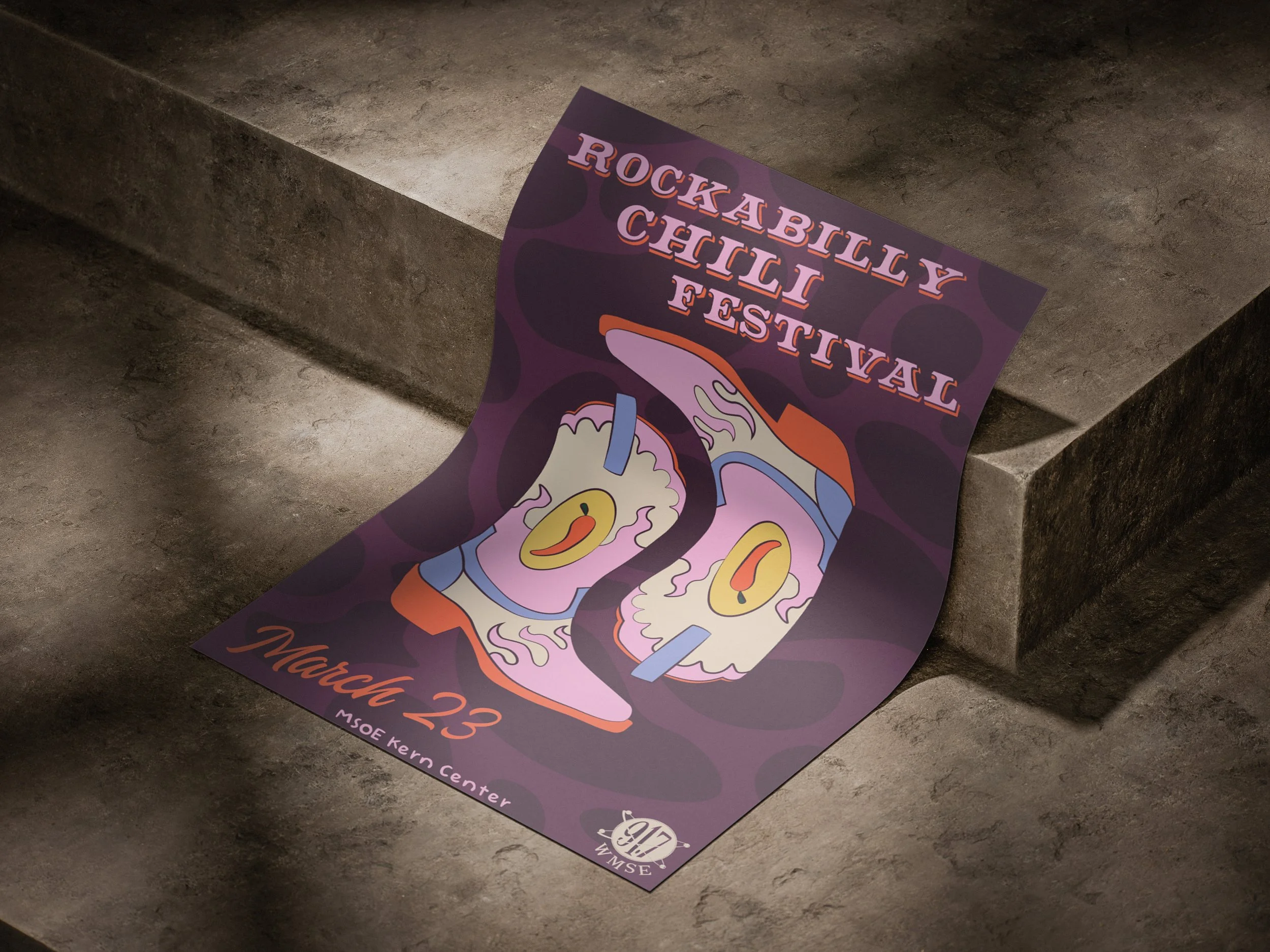
Rockabilly Chili Fest
Advertising Design
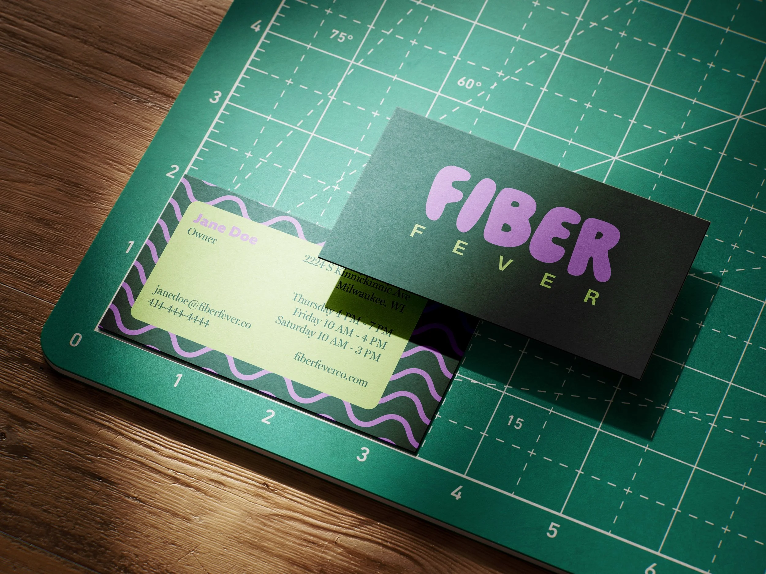
Fiber Fever
Brand Design
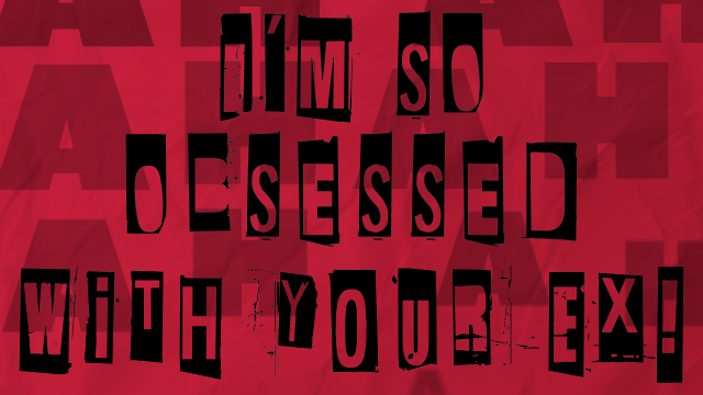
OBSESSED
Motion Design
STROBE
Brand + Packaging Design